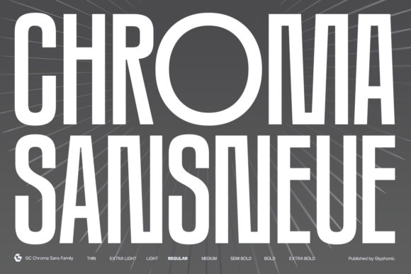
Chroma Sansneue Font: A Web Designer’s Layout Test
I was staring at a Figma frame for a new boutique skincare brand last Tuesday, feeling that familiar sense of typographic fatigue. The project needed to feel premium and modern, yet accessible and clean. My usual rotation of geometric sans serifs felt too cold and corporate, while the humanist options looked a bit too soft for the bold product photography we were using. I needed something with structural integrity but enough character to carry the brand identity without screaming for attention. That is when I decided to test Chroma Sansneue in a live layout environment.
As a web designer, I have learned that a typeface specimen sheet can be deceiving. A font might look beautiful in a static PDF but fall apart when subjected to responsive breakpoints, variable content lengths, and different screen densities. Chroma Sansneue is marketed as a condensed display sans family, but my primary concern was whether it could actually perform as a functional tool in a digital product ecosystem. After integrating it into the skincare site’s hero section, navigation, and product cards, I found that this typeface offers a specific blend of precision and versatility that solves several common UI challenges.
Taming the Hero Section Without Sacrificing Impact
The first real test for any display font is the above-the-fold hero section. For this skincare project, we had a large, high-contrast lifestyle image with a headline that needed to communicate "clinical efficacy" and "natural luxury" simultaneously. Wide-set grotesques often eat up too much horizontal space on mobile devices, forcing awkward line breaks or reduced font sizes. Chroma Sansneue’s condensed proportions allowed me to maintain a massive optical size for the headline while keeping the text block narrow enough to leave breathing room for the imagery.
What stood out immediately was the letterfitting. Many condensed fonts suffer from cramped counters and touching stems at larger sizes, creating visual noise that distracts from the message. Chroma Sansneue feels engineered specifically for digital screens. The internal white space within characters like 'e', 'a', and 'o' remains open even at heavy weights, which preserves readability against complex background textures. This balance of strength and openness meant I didn't have to manually adjust tracking in CSS to prevent the text from looking muddy on Retina displays.
Visual Hierarchy and Scanning Behavior
In e-commerce design, users do not read; they scan. Typography must act as a series of signposts guiding the eye toward conversion points. Because Chroma Sansneue has such a distinct vertical stress, it creates strong directional cues that pull the user down the page. I utilized the heavier weights for primary value propositions and the lighter weights for secondary supporting text. The contrast between these weights is significant enough to establish clear hierarchy without needing to rely solely on color or size changes.
- Headlines: The Bold and Black weights provide immediate focal points that anchor the layout.
- Subheads: Medium weights offer enough presence to separate sections without competing with the main title.
- Captions: Lighter weights remain legible at smaller sizes, perfect for product specs or disclaimer text.
This inherent hierarchy reduces cognitive load. When a user lands on the page, the typographic structure tells them exactly what matters most before they even process the semantic meaning of the words. For a digital brand kit, having a single family that can handle this entire spectrum of emphasis simplifies the design system significantly.
Readability Considerations for Responsive Interfaces
While Chroma Sansneue shines as a display font, I approached its use in UI elements with caution. Condensed typefaces can sometimes become illegible inside buttons or form labels where vertical height is restricted. During the mobile prototyping phase, I tested the Regular weight inside primary call-to-action buttons. At 16px base size, the characters remained distinct, though I did increase the line-height slightly to 1.5 to prevent the ascenders and descenders from feeling squeezed within the button padding.
For body copy, however, I opted to pair Chroma Sansneue with a wider, more traditional neo-grotesque sans serif. While you could technically set paragraphs in this font, its condensed nature is optimized for short-form impact rather than long-form reading comfort. Using it strictly for headers, pull quotes, and navigational elements allows the font to do what it does best—create atmosphere and structure—while the supporting typeface handles the heavy lifting of information delivery. This pairing strategy ensures the site remains accessible and WCAG compliant while retaining that distinctive modern edge.
Dark Mode and Contrast Performance
Modern web design requires robust dark mode support, and this is often where display fonts fail. Thin strokes can disappear against dark backgrounds, and thick strokes can bleed due to light bloom. Chroma Sansneue held up remarkably well in our dark theme testing. The stroke consistency across the family means that switching from light to dark mode doesn't drastically alter the perceived weight of the typography. I found that the Medium weight worked better than Regular for light-on-dark text, providing just enough mass to counteract the optical thinning effect that occurs on emissive screens.
Practical Application Across Digital Touchpoints
Beyond the main website, consistency is key for brand trust. I exported assets for social media templates and email newsletters using the same Chroma Sansneue settings established in the web design system. The font translates beautifully to square Instagram carousels and vertical Stories because its verticality maximizes space efficiency. In email design, where rendering engines can be unpredictable, the webfont version loaded cleanly with appropriate fallbacks, ensuring the brand voice remained consistent even if the custom font failed to load.
For designers considering this for client work, checking the licensing and technical specs is non-negotiable. Before deploying, verify that the commercial license covers all intended digital touchpoints, including web embedding and app usage if applicable. Review the available language support to ensure special characters render correctly for international audiences. Also, explore the OpenType features; many modern display families include alternate characters or ligatures that can add unique flair to logo treatments or campaign-specific graphics without breaking the cohesive system.
Elevating the Digital Brand Experience
Choosing a typeface is ultimately about translating business goals into visual language. Chroma Sansneue succeeded in this project because it bridged the gap between editorial elegance and interface utility. It provided the boutique store with a confident, contemporary voice that felt intentional rather than decorative. For web designers and digital product creators tired of generic typography, this family offers a refined alternative that respects both aesthetics and usability.
When building your next landing page, portfolio, or online shop, remember that typography is the foundation of user experience. A font like Chroma Sansneue does not just fill space; it organizes it. By prioritizing readability, testing rigorously across devices, and understanding the specific strengths of condensed display faces, you can create digital environments that are not only visually striking but also intuitively navigable. The right typeface makes the design process smoother and the final product significantly more polished, turning casual visitors into engaged users through the subtle power of well-crafted letters.